The Final Title Design

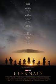
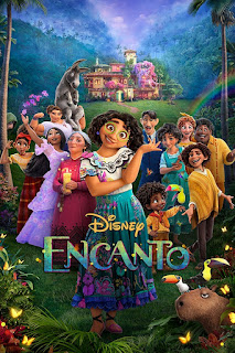
Font: The font style that I decided to go with for my film was ariel, I went with this because as one of the fonts because it is bold and larger than other fonts. Another one I went with was Georgia. I went with this one because it gives a formal tone to the font and allows the reader to realize that this is a bit more soft, formal, and serious. Examples: Ariel: This is Arial font Georgia: This is Georgia font Contrast: The titles will be either black or white. The reason for this is because the film will majority have color and not much black and white so it will always show compared to the background of the film. The size of it will be 20pt font so it doesn't take up most of the screen at the time but does allow the reader to be able to easily understand the title. Example: This is a Car Working Title: At this point, I believe the title of my film will be Mission Electric. I think this is a good title because of what is going on throughout the film and it descr...
